Designed menopause support for women who've been googling their symptoms alone at 3AM
A billion people go through menopause. The apps that existed treated it like a footnote. Here's what I built, what I learned, and what I'd change.
My Role
Team




With
Timeline
IMPACT
task completion
(down from 3 min)
home actions
(simplified)
accessibility first
CONTEXT
Existing menopause apps served tech-savvy users well but alienated women 50+
Women in their 50s were Googling "am I dying or is this menopause" at 3am. They weren't talking to anyone about it. When they tried existing apps, they abandoned them.
What Research Revealed
I interviewed 5 women across different menopause stages (ages 45 - 65).
The pattern: they downloaded apps but found them unusable.
The Core Problem
The apps assumed tech literacy.
Too many features they didn't understand. Icons without labels. Complex navigation. Clinical language. Felt designed for their daughters, not them.
RESEARCH
Five interviews. One Pattern That Changed Everything.
Full disclosure: I came into this knowing almost nothing about menopause. I left understanding why a billion people are underserved.
The biggest barrier wasn't lack of information. Women weren't confused about menopause - they were navigating something alone that nobody around them seemed willing to discuss.
“ I am comfortable talking about it but I sense a lot of hush hush from others. Instead of shying away from the topic it should be openly discussed. It is a normal phenomenon, what’s to hide? ”
Turning Interviews into Direction
After affinity mapping and synthesis, two distinct behavior patterns emerged:
Mei
42% of our users
Independent • Tech-Savvy
Context: Lives alone, wants quick coping methods and control
"Give me information fast and let me decide what to do with it."
Needs: Quick access to data, customizable tracking, straightforward answers
Sunita
58% of our users
Family-Oriented • Less Tech-Comfortable
Context: Needs discreet solutions, doesn't want to explain to anyone
"Help me without making this a big deal."
Needs: Simple interface, anonymous options, immediate help during symptoms
My Strategic Decision
Design for Sunita first. If she can use it, everyone can. If we design for Mei, we lose 58% of our users. This single insight shaped every interface choice that followed.
PROBLEM FRAMING
Testing validated the problem
I ran usability tests with the mid-fi prototype. Participants over 50 got stuck consistently.
QUANTITATIVE DATA
Task success rate
50%
Avg time on task
3min
Avg misclicks
2.9
QUALITATIVE DATA
Icons were useless: "I don't know what these pictures mean"
Navigation confusing: Kept getting lost
Information overload: Felt overwhlemed
“ I don't know what these pictures mean. ”
— Participant trying to book doctor appointment
“ I couldn’t really tell these were different sections to tap on.”
— Participant trying to book doctor appointment (took 3 minutes)
Mid-fi home screen with unlabeled icons and hard-to-discover tabs for elderly users
The Challenge
How might we make the app usable for women who might open it in a panic during a hot flash?
DESIGN DECISIONS
Three decisions that defined the product
I ran usability tests with the mid-fi prototype. Participants over 50 got stuck consistently.
DECISION 01
AI Companion, Not Chatbot
What I did: Designed conversation flows that speak like a knowledgeable friend, not a medical database.
The craft: I scripted 15+ AI response variations for vulnerable moments like "I think I'm broken."
Why it mattered: Women were already Googling — they needed better answers in a safer space.
💡 This was the decision judges mentioned most in their feedback
DECISION 02
Smartwatch Over New Hardware
What happened: The team was gravitating toward recommending specific wearables. I pushed back.
My reasoning: Cost barrier would kill adoption before users tried the app. They already owned smartwatches, they would be our health sensors.
The solution: Biometric monitoring for breathing and heart rate to detect hot flash onset, with discreet wrist alerts.
💡 The constraint became the feature
DECISION 03
Emergency Alerts Surface Actions
What I designed: The home screen isn't a dashboard — it's a hub where alerts surface alongside immediate actions.
The flow: When a hot flash alert fires, you get:
→ A breathing exercise (immediate relief)
→ A community thread (you're not alone)
→ A doctor booking option (if it's getting worse)
💡 The alert was the trigger. The response was the product.
EXECUTION
Iterations
I went through three major iterations, testing with 4 participants over 50 after each version.
Version 1: Initial Mid-Fi
Mid-fi prototypes with unlabeled icons and hard-to-discover tabs for elderly users
WHAT WORKED
- Flat information architecture felt intuitive
- Bottom tab navigation felt familiar from other apps
WHAT DIDN'T WORK
- Icons had no labels — users didn't know what they meant
- Home screen too crowded with 6 cards
- Participants couldn't find the AI assistant
- Task completion time: 3 minutes average
Version 2: Labels Added
Mid-fi home screen with labelled icons and actionable emergency alerts
WHAT WORKED
- Icons now had labels — immediate improvement in comprehension
- Larger font sizes (16pt minimum) improved readability
- Actionable emergency alerts were better
WHAT DIDN'T WORK
- Participants couldn't distinguish critical symptoms from daily stats
- AI assistant icon was confused with customer support
- Participants got lost between tabs
- Task completion time: 1.5 minutes (better but not good enough)
Version 3: Final (Shipped)
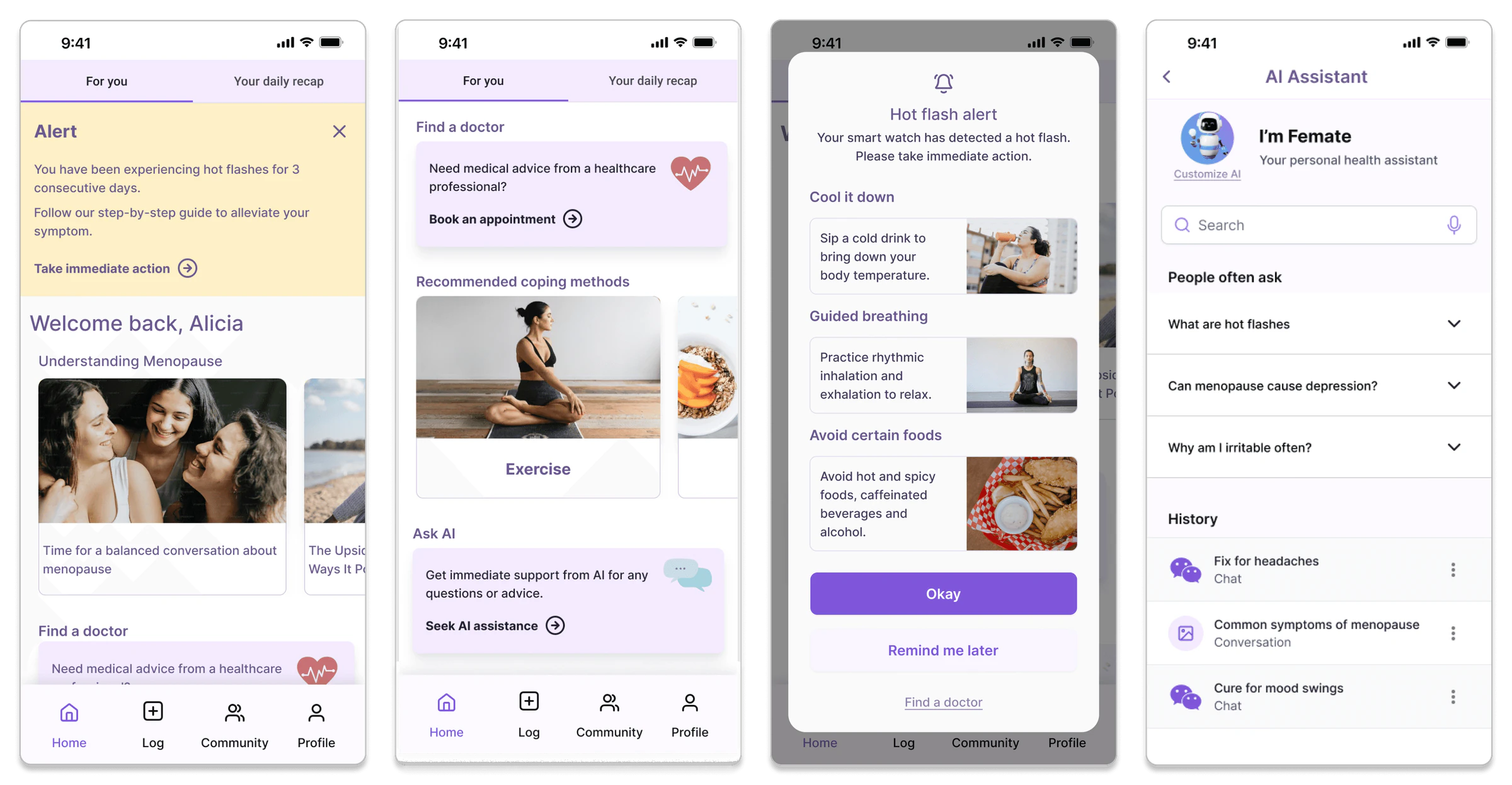
High-fi screens with labelled icons, redesigned navigation and actionable CTAs
WHAT WORKED
- Prominent critical symptom alert banner
- Dedicated sections to book appointments & chat with AI on home screen
- Added actionable CTAs visible upon receiving alerts
- Reorganised home screen into 2 focused tabs
- Task completion time: 28 seconds average
- 100% task success rate
WHAT DIDN'T WORK
- N/A — all usability targets met in final testing
OUTCOMES
What Actually Shipped
Best Design Award
IterateUX Challenge
task success rate
(up from 50%)
avg task completion
(down from 3 min)
Final Features
- Home Screen: 3 primary actions — Critical symptoms alerts, weekly health summary, Education/Awareness, Find a Doctor, Talk to AI
- Symptom Tracker: Quick-log buttons, optional details
- AI Companion: Conversational interface with pre-filled prompts, customizable appearance
- Community: Topic-based groups with one-tap join, anonymous posting option
- Emergency Alert (Phone + Smartwatch): One-tap alert, sends cooling tips immediately, logs automatically
High-fi prototypes for smartwatches
The Trade-Off I Made
We lost some visual polish. But we gained usability for the people who actually needed this app. I prioritized accessibility for the person who's struggling — not the person who finds everything easy.
REFLECTION
What I'd do differently
🏳️⚧️ Include transgender women in research
Menopause is not exclusively a cisgender female experience. This was our most significant gap — and the first thing I'd address in any follow-up study.
🌍 Build multilingual support from day one
We designed in English only. That excludes huge portions of our target audience.
🤖 Deeper AI conversation logic
In testing, a participant said she was having chest pain. Our AI suggested breathing exercises. I'd build symptom severity triage into the AI's first response — not just coping tips.
What I Learned
✓ Usability testing with the actual age group is non-negotiable
Our assumptions were wrong. All of them. Testing with 50+ users revealed failures we never would have caught designing for ourselves.
✓ Simplicity beats feature bloat every time
Every time I wanted to add something "cool," I asked: "Would Sunita use this during a hot flash?" That question killed half our feature backlog — and made the app better.
✓ Constraints drive better solutions
The smartwatch limitation forced us to a better answer than unlimited budget would have. Designing within real cost constraints pushed us to actually solve the problem.
THE BOTTOM LINE
I designed an app that women 50+ could use during their worst moments — not just their best ones. That meant killing features I liked, simplifying things I thought were "intuitive," and testing until the design actually worked for people who weren't me.
Next project · Yes, Chef!
Turns out the hardest part of learning to cook isn't the technique - it's not giving up.